Special
Thanksgiving Issue
As
confusing and unfocused as it is good intentioned
"Heroes for Hope!"
Story
– Claremont, Nocenti, Wrightson, Starlin & Shooter
Writer
– Various
Penciller
– Various
Inker
– Various
Letterer
– Various
Colorist
– Various
Editors
– Ann Nocenti & Chris Claremont
Assistant
Editors – Pat Blevins & Terry Kavanagh
President
– Jenette Kahn
December 1985
So
in 1983 there was this huge famine in Ethiopia.
Bob
Geldof, star of "Pink Floyd –The Wall" and lead singer of The
Boomtown Rats joined with Midge Ure, frontman of Ultravox, came up with the
idea of a musical jam called "Band Aid" which resulted in a musical single called
"Do They Know It's Christmas?" made up of all these UK and Irish
musicians donating their talents with proceeds going to famine relief.
They
expected to make around 70,000 pounds. The song sold 3 million copies and
earned a staggering Eight Million pounds in the first year alone. It lead to
other spin-offs and charity music events that cluttered up the end of the
1980's.
Pretty
good for a song recorded in one day, November 25, 1984. Pretty good for a song with so many various
big names singing one line of lyrics that it makes for really jarring
listening. Pretty good for a song that kinda sucks. Yeah, I'm gonna say that. There's been enough time, it's not too
soon. This song and the American equivalent "We are the World" make
for uncomfortable listening. Not because of lyric choice but because the tone
and style of each artist given a 3 second window to belt out a line makes for
five miles of bumpy road. I don't like them that much. I would have enjoyed a
single song by each musician better.
Exactly
like this comic book that came out about a year later.
It
is worse than DC's Heroes Against Hunger in many ways. The concept for both is
to give our super-people a tangible force that represents famine and the plight
of the African people. In HAH we had a alien space vampire that lived off
misery and death. Here we have much the same, although it is more a phantom
personification than a material foe. And that makes the book's conflict more confusing and ending a
muddled thing that, while more upbeat than HAH, is ultimately less satisfying.
The
art though-out is not as cleanly transitioned, with artists being given from
one to three pages to illustrate/write. While this might make their individual
pieces have more space to shine, it creates pages that end on even numbers with
the odd number page across from it being awkwardly different or jarringly
strange.
So
dissimilar in style and content are these open page shifts in art teams, that you immediately pay more attention to WHO
is doing the writing or drawing and less attention to the actual story. And the
story consistency from one team to the next is a mad, confusing affair anyway.
In
the end, I applaud their efforts and whatever success they had with this
endeavor. I enjoyed seeing several artists take on characters they had never
touched before. However, the book as a whole is not something I would ever
recommend to a comics reader as a "good book."
Just
like with Heroes Against Hunger, I'm going to post entire pages in sequence and
give my running commentary on how the story and tonal shifts don’t work for me.
There are astonishing sequences that are powerful and other parts that are just
confusing. The only way to get that is to see the pages yourself. So on to part
one of this mess.

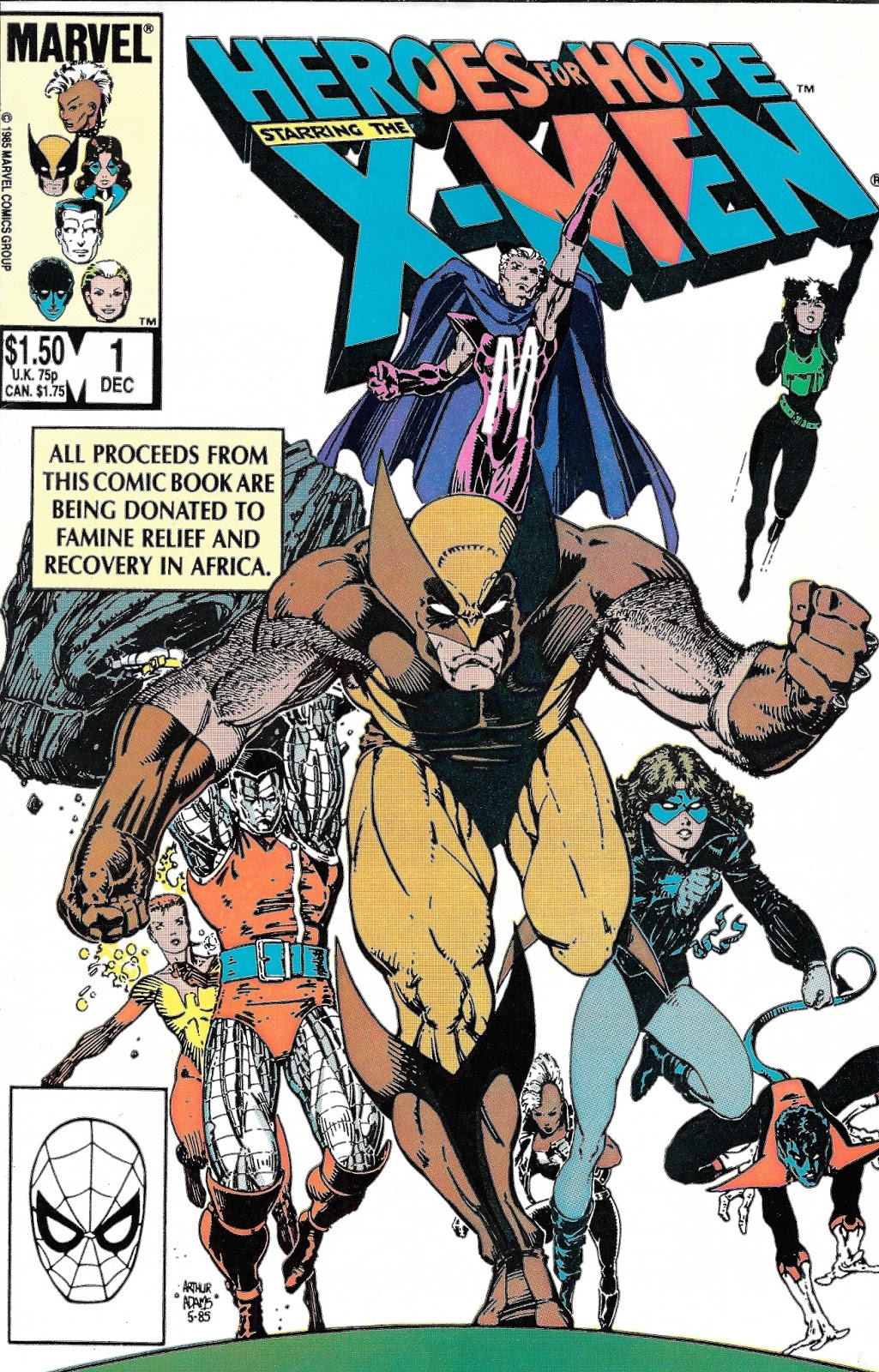
Here
is our legend, the inside front cover. Instantly you'll notice some big-name
additions here that are both new and odd choices for the X-Men, but if you are like me,
that just raised the excitement level. Especially given that Chris Claremont's
hands were all over this, him being one of the chief architects of the team for
this decade.
So
we start with Stan Lee, the mind that made much of the Marvel universe, with
John Romita, Jr., the chief penciler of The Uncanny X-Men of this era being
inked by Al Gordon. They throw us on the doorstep of the X-Men mansion, with
Rachel Summers/Phoenix, Jean Grey's daughter from the future where the mutants
were hunted that didn't happen because the X-Men prevented an assassination yet Rachel
still came back in time and now is member of the team yet can't tell her Mom
about being her daughter because Jean never HAD a daughter and emotional reasons…(*sigh* X-men
comics, anyway!)…screaming a Darth Vader-like death howl on the front porch because
everything outside the mansion has gone all "Gobi Desert" and their
postman is dying trying to deliver the mail. Shadowcat goes to help the poor
fella while someone finally shuts up Rachel.


We
keep Stan Lee (who does well for these four pages, maybe he should have written
the entire thing?), jump in John Buscema for John Romita, Jr and Klaus Janson
on inking. The result is not that noticeable of a shift as both Johns' styles
are very in keeping with established comic book conventions. Story-wise, we get
Wolverine doing what he does best, which is using his preternatural senses to
know this is all an illusion, although one that seems to sap Shadowcat's will.
Here is one of my big gripes of the story: this is a new enemy the X-Men are
fighting, yet because of the writers involved and the free hand given them, we
don't know what its attacks actually DO or what its powers ARE. It's hard to
care about defeating an enemy that the audience can't understand.


As
if the editors are reading my mind, we get a bump as the next page across from
that last is a new team of writer/artists BUT they are only there for one page.
This puts us on track for two pages sitting face up that are by one team. Huzzah! No odd left-right comparisons because we will have the same teams on both pages.
Too
bad Marvel screws this up almost immediately.
The
single page in question is by Ed Bryant as writer with Brent Anderson on
pencils and Joe Sinnott on inks. Joe's the only name I recognize out of those. The
writer might be a sci-fi author Edward Bryant, Jr. but I kinda doubt it. Brent
Anderson did God Loves, Man Kills and the Kazar and Strikeforce: Morituri
series for Mavel. He co-wrote Astro City too. His pencils here are good and
transition okay from the previous page, but still seem a bit off. The story
trots out X-Men tropes and we kind of creep to a stall. Also note that Kitty
was unaffected by the aging from the illusion here.

Then
we got to the pages we were waiting for: John Byrne pencils, and Terry Austin
Inks. Louise Simonson subs in for Chris Claremont and does a GREAT job of it!
This feels like a straight out of "John Byrne X-Men era" story here.
Everything is in place.
Colossus
is targeted by the entity I'm going to nickname "Depressory," like
those memes that are meant to counter the inspirational quotes pictures. So for
THREE pages, Colossus is tormented by this dispiriting force that makes him
feel his armored form is a way of maintaining an emotional distance from everyone.
That's the way the rest of the issue goes, with each character getting one-on-one
with the entity, before and after some brief interaction with the group.


And
I only have one problem with this. Sure, this is kind of a common storytelling
technique. You show each hero's struggles individually giving an entire group conflict
a personal meaning. However, in this case the effects of being attacked are so
arbitrary. Take our next sequence. As Colossus descends into the depths of
anguish, Storm looks on in manner that appears disinterested in his plight, a
very uncharacteristic act for her. Also note that due to Byrne's team getting
three pages to play, this sits opposite his last page, creating a contrast in
art styles that doesn't complement each other very well. The scripting is by Ed
Bryant again, with Brent Anderson again on pencils only this time we have Dan
Green doing inks. It FEELS like someone dropped this in AFTER the issue was put
together to transition the Colossus sequence to the next Shadowcat sequence. I
like about 75% of the page. That shot of Kitty on the bottom right looks a bit
odd for some reason. Like one of those 1970's in book advertisements for GRIT
or something.

Wherever
it came from, the page does transition us to our next sequence. The art is by
horror great Berni Wrightson being inked by Jeff Jones. The words are by horror
master and my doppleganger Stephen King. King doesn't do a bad job of writing
this, but there isn't a lot of dramatic punch to his sequence. Kitty gets
touched by an "Angel of Death" which emaciates her. While she
struggles on the floor, the figure taunts her for THREE PAGES, enough to get us
back on track for two pages by a single creative team being side-by-side.


Kitty
is drained by the entity, who emaciates her in these panels. But don't worry.
Remember how I talked about the effects of each attack being odd? Later we'll
see that the attacks don't do anything to the person physically, just mentally.
And the cure for the attacks? A good lie-down. That's right, a couple of hours
of bed rest and they are right as rain. Kind of a clunky concept. The writers
could have put together a threat that did seem to have an actual jeopardy
element to it. Instead we get a take two aspirin and call me in the morning
threat.
All
of this leads to Nightcrawler finding Kitty on the floor and his subsequent
attack by the Depressory, this time targeting Kurt's feelings of self-worth.
The pages are brought to us by one of my favorites, Bill Mantlo and the pathos
created is of the decent variety. The idea put forth is that if Kurt killed
himself there would be more to eat for others on the planet. Art stuffs go to
penciler Charlie Vess and inker Jay Muth, both accomplished in the field and
they acquit themselves nicely here.


Note
that emaciated Kitty sits up to swaddle Kurt here.
Then
we get a one-page where everyone emotes. This was a hallmark of the Claremont
X-Men era, this lingering angsty vib in every book. This single slip-in page is
written, as the other was, by Bryant and penciled by Anderson, but now Tom Palmer
steps in on inks. Palmer's inks really do the work too. That looks the way I
expect X-Men books to look.

So
we get comfortable with being in a series of standard issue panels...and then
this happens!


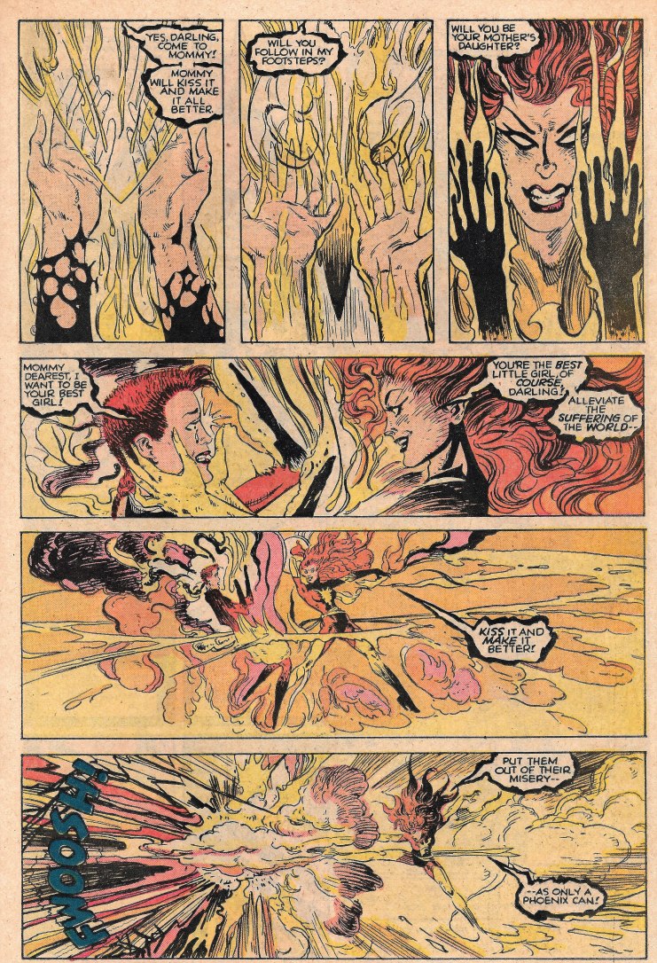
Yup!
That is Amazing Artist and Heavy Metal alumni Richard Corben doing all the art
chores. Those pebble textures are so easily recognizable. As are his facial
structures and shadings. What isn't evident right away is that Alan Moore…Alan!
Freaking! Moore! is doing the scripting. Both Moore and the entity do a
mind-job on Magneto, turning him into the very fascists that murdered his
family. The essence of this attack being that Magneto represents authority out
of control that causes loss of life instead of protecting it. An action that causes specters
to haunt those authority figures from then on. Corben is at his knife's edge
best in these shots…BUT it is a big transition from the other part of the book
to his work. It arrives as a surprise, and a pleasant one, but a surprise
nonetheless.
Also
Corben's non-standard comic book art wouldn't be quite so disruptive to the
flow if it didn't exist across the page from this starting three pager on Rachel
facing the Depressory. Mike Kaluta does a fine job on the art, while Al Milgrom
does his standard heavy-handed inking over those Kaluta pencils. Ann Nocenti
doing the writing, which for me is a hurdle to get past. She wrote some really
bad Daredevil (almost called that Daredrivel)
and I find this goes pretty much the same way. Especially the "Rachel…my
one and only bouncing baby coochi-coo." line.


Next
the Depressory turns its attentions to Wolverine and we get a decent three page
action sequence that pits the feral part of his nature against his humanity and
*yawn*…even though well drawn by Frank Miller, pencils; and Bill Sienkiewicz,
inks; this is a story that we'd only seen a few hundred times by this point, which was the mid 1980's. Seems if they were going to give writer Harlan Ellison
something to do with Wolverine they could have found some original ground for
him to cover. This is a sad waste of time and talent. We get it! He's at war
with himself. Now move along.


…to
Storm, who is chasing around a ringleader while putting penciler Brian Bolland
and inker Craig Russell through a series of costume changes that really serve
no purpose whatsoever. Who is writing this part? Ahh, Chris Claremont. That
explains everything.

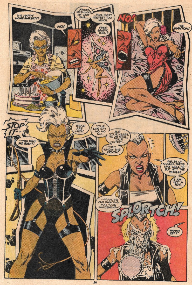
We will end Part One here, with Storm racing to confront
the mysterious entity that has been causing all this ruckus.
And in keeping with the charitable giving thought these books were based off of, I'm throwing out another very worthwhile charity: The international Children's Fund found on the web HERE. As we go in to spend time with our families and friends, please remember to reflect on all that you have to be thankful for and all the opportunities you have to make someone's tomorrow something to be thankful for too.
No comments:
Post a Comment
Note: Only a member of this blog may post a comment.